9

Is there any wiggle room on us being able to change the look and feel of the main DBA site? It just seems a bit bland, and I think it's a bit hard on the eyes because there is no real contrast.

I'm really talking about colors here. Maybe make the blues pop out a little more. It tends to get a bit rough distinguishing text and that sort of thing.

Or is it just me...?

2
  • 1
    There is some wiggle room, but it needs to be well designed and defined for the SEI team to effect changes. If you can suggest solid changes, that would be great, but seeing as how usually people just say "it looks broken" that's not tremendously helpful, if you follow my drift. If you can mock up screenshots and share color codes and the like, then that would be a lot more of what Jin would need.
    – jcolebrand Mod
    Commented Apr 5, 2012 at 3:43
  • 1
    The blues already pop out pretty strongly because it's one of few colors, and they look off with too much saturation. There's wiggle room but I'd suggest feature-requesting specific changes if you think you've got a good one, and mockups definitely help.
    – Zelda
    Commented Apr 6, 2012 at 16:08

1 Answer 1

-1

If anything, something needs to be done about the "accepted answer" color. When I look at the overall question list (and questions in my own profile) you need to look very closely to determine if there is an accepted answer or not.

I've included some screenshots comparing dba to the AskUbuntu site.

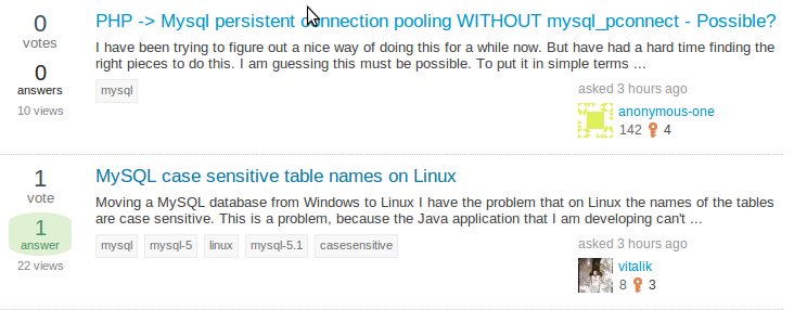
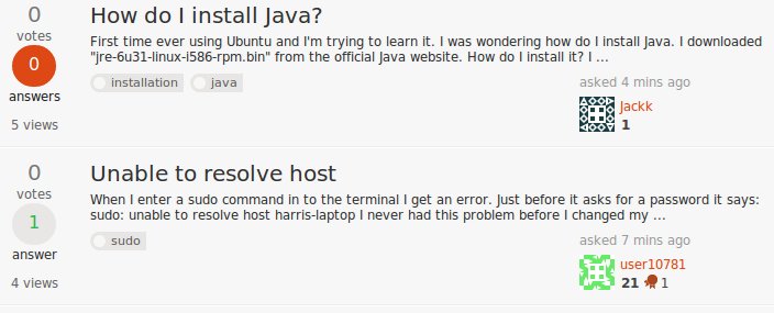
Overall question list comparison:

dba question list

vs.

enter image description here

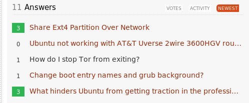
Profile question list comparison:

enter image description here

vs.

enter image description here

As you can see, it is MUCH easier to discern questions with accepted answers on the AskUbuntu site.

I'm thinking that maybe the DBA site should have something with a little more contrast. Like a blue silhouette of the database icon or even the database icon itself like this:

enter image description here

Just my thoughts.

3
  • Actually, I just realized that my question list screenshot of AskUbuntu was not of an accepted answer. But I believe that the point is still illustrated.
    – Aaron
    Commented Apr 7, 2012 at 14:20
  • 1
    I can see that AskUbuntu has more contrast, but I certainly don't have to "look very closely" or see AskUbuntu's contrast as "MUCH easier" or even easier at all. Perhaps you've already checked this, but is your monitors contrast set too low? Commented Apr 9, 2012 at 20:45
  • Hmm...that could be. My laptop and home system shows a faint, light greenish glow around the accepted answers that's really hard (for me, anyway) to see. But on my work computer, it looks fine. Regardless though, Ubuntu contrasts well on all systems.
    – Aaron
    Commented Apr 10, 2012 at 12:37

You must log in to answer this question.

Not the answer you're looking for? Browse other questions tagged .