19

I'm Jin, and I'll be working on the designs for the Stack Exchange sites as they graduate from the beta phase. Each site will have its own unique theme that will reflect its topic. However, all sites will share common elements so they feel like they're part of the Stack Exchange family.

First, thank you for starting the design discussion early. The answers in that post helped me a great deal. I agree with most of them, especially Leigh's suggestions:

  • The theme shouldn't be garish.
  • The theme shouldn't distract from content.
  • The theme should fit in with other SE sites.
  • The theme's widgets not be too strange and should be easy to understand for new users.

Other concepts that might fit the site design:

  • A grid reminiscent of a table storing data.
  • ER diagrams.
  • Venn diagrams.

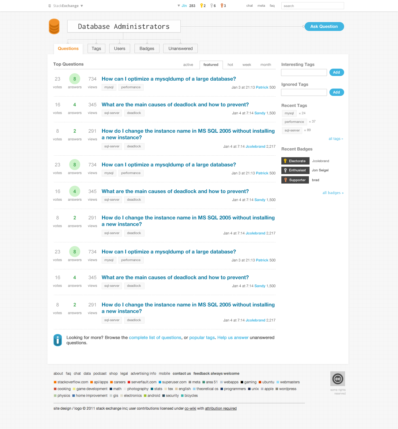
During my research for this site's design, I talked to several DBAs and programmers, as well as looking at many screenshots of DB related software UIs. I decided the design should be very clean but with enough visual elements to give the site its own unique branding and personality.

(click image below for full resolution version)

DBA.SE homepage design

To convey the "DBA" theme visually, I believe a cylinder logo, badge key and chart symbol motifs work well since they're universally recognizable. This is not a graphical heavy design, but I don't think it needs to be. The simple and elegant look suits this site.

I'd love to hear your feedback. If there are no major design changes, I'd like to launch this site early next week. So an early grats from me!

11
  • Nice! Me likey! Commented Aug 12, 2011 at 19:10
  • Like the keys for badges and the linking relations to the tabs. Commented Aug 12, 2011 at 19:19
  • Thought: Can we still maybe get one or two guys assembling the logo?
    – jcolebrand Mod
    Commented Aug 12, 2011 at 19:43
  • 1
    @jcoleland I tried that first but it became a bit cartoony. Also a simpler logo translates well in other mediums and sizes. btw I'm sure there are gals who are DBAs too :) (another reason I don't like to use humans in designs, unless I make it androgynous, which becomes cartoony)
    – Jin
    Commented Aug 12, 2011 at 19:47
  • 1
    Oh I envisioned something like this: (lemme go find a link) i.sstatic.net/1dCIW.jpg
    – jcolebrand Mod
    Commented Aug 12, 2011 at 19:50
  • 1
    I think the graph paper around the outside could be an ever so slightly darker shade of grey or bluish-grey (or the graph lines just a bit darker), to set off the margins from the center of the page a bit. Commented Aug 12, 2011 at 19:56
  • @Robert ~ Perhaps ...
    – jcolebrand Mod
    Commented Aug 12, 2011 at 19:59
  • @robert i'll play with that when i'm doing the css conversion. the tricky part is everyone's monitor gamma is different, so it may look darker or lighter for most people.
    – Jin
    Commented Aug 12, 2011 at 19:59
  • 1
    @jcolebrand: And if you can't get that into the design, at least you can still make a curtain, table-cloth, or a pair of pants with it. :P Commented Aug 12, 2011 at 20:01
  • @Jin: You may be right about that; I tilted my laptop monitor up so that I was at a 90 degree angle with it, and it looks much better. Commented Aug 12, 2011 at 20:02
  • 2
    Needs more rage
    – Shog9 Mod
    Commented Aug 12, 2011 at 20:28

4 Answers 4

8

While I really like the idea of getting out of beta as soon as possible, and I feel a bit guilty since my comments factored so prominently into the design, I wonder if some improvements could be made.

There are things that I like about the design. The key logos, the relational tab lines, and the grid background all work well for the design. Here are some hopefully constructive comments.

  • The big three sites (stackoverflow.com, serverfault.com, and superuser.com) all have a very cohesive color scheme that tie into a color on the site logo. The logo in this design does tie into the text color of the tabs, but if this is to be the theme color for the site I wonder if it (or shades of it) should be used in more places like the question text, user names, ask question button, tags, etc. Some things may need to be different colors and certain elements require differences such as the green answers and the key colors.

  • The logo is unmistakably a database logo, but if you were to take the logo outside the context of this site, it isn’t distinctive enough to be a site brand. Someone who sees this on a tee-shirt, bumper sticker, etc. would recognize it as a database and nothing more. Perhaps the cylinders should be opened up to show some gears inside. That may be too complex. I’m not sure what it should be I just know the big three sites and many others do this well and a more distinctive logo would do wonders for site recognition.

  • The big three sites and some of the others tie the site name into the logo although the logo should be able to stand on its own, the logo and the site name should also be able to stand on their own and look like a cohesive brand.

  • I like the crows feet connections to the tabs, but I wonder if they don’t seem like tabs any more. Perhaps if the border on the bottom was removed and the left and right borders extended to the white space they would feel more like tabs and therefore provide necessary affordance. This may not be simple, but it shouldn’t interfere with the crows feet. If they become clearly tabs when rolled over, then this suggestion may not be needed.

  • The site would be more distinctive if the shape around the answer number were a cylinder silhouette rather than a circle.

  • This isn’t a specific idea, but overall the design has an unprofessional almost child-like feel. I appreciate that you avoided logos that were too cartoonish, but when I look at sites like tex.stackexchange.com, english.stackexchange.com, and security.stackexchange.com they scream, I’M A PROFESSIONAL, I KNOW WHAT I’M DOING! This site needs that. A user should come to the site and should immediately get the impression that these people know what they are doing so I will get good answers here. I’m not quite sure how to achieve this design wise, whether it just needs darker colors, a more complex header, or something else entirely. I hesitate to say start over, but Jin, I know you can do better.

Note: I am not a designer; I'm just passionate about this site.

7
  • I like the idea about removing the bottoms of the tabs. Maybe just on the active tab? Thinking how a tabbed interface looks here. Next up, the logo: I'm not good enough to come up with a logo either :\ so I don't know what to say there. But I agree, having a unique logo would help. I'm not sure how this site doesn't look professional tho. Maybe I'm just too used to the stacks. I'm pretty sure the competition here is the OSQA for ask.sqlservercentral.com and a couple other forums, so I think this theme already beats those. Hmmm...
    – jcolebrand Mod
    Commented Aug 14, 2011 at 3:33
  • 2
    It is specifically the other stackexchange sites that I am comparing this design to. Check out security.stackexchange.com, diy.stackexchange.com, english.stackexchange.com, apple.stackexchange.com, tex.stackexchange.com, webmaster.stackexchange.com, or even cooking.stackexchange.com. To me they all look more professional. Perhaps it is the color intensity, color cohesion, logos, gradients, distinctive backgrounds, or specialized text. I don’t know it is just my impression. Beating other database QA sites is good, but taking it to the next level would be even better. Commented Aug 14, 2011 at 19:56
  • @Leigh appreciate the feedback, many good points. The design goal is to make the site simple and clean, like Stack Overflow. Some of the other SE sites I've created have more clear visuals people identify with, e.g. cooking, gaming, apple etc, so they're a bit more graphical, while others do not, e.g. math, theractical computer science, unix etc. For the latter type of sites, I typically just keep the design simple. There isn't a strong imagery for DBA.(except for the cylinder symbol and others you suggested). As far as looking "professional" goes, only the content determines that. [1/2]
    – Jin
    Commented Aug 15, 2011 at 4:12
  • [2/2] Compare SO's design to the SE sites you mentioned, one can say that SO doesn't look professional either. Also for the other sites I used a serif typeface so maybe that's why they appear to be more "authoritative." I can certain improve the design based on your point #1 - #5. But as for the last one, I do not think the design looks childish. Please keep in mind, I often tweak the design post site launch too. I'm definitely up for some tweaking based on community feedback after they use the new design for a bit.
    – Jin
    Commented Aug 15, 2011 at 4:17
  • @Jin Thank you for considering my comments. I see what you are saying. SO and the other sites you mentioned do also have a plain designs. SO is such a success because of the vast superiority of the intelligence behind it not because of and perhaps in spite of the graphical design. Many of the SE sites have nicer visuals. Tweaks along the lines of 1-5 will improve things dramatically and should bring the design to the level of the other sites with simple designs. [1/2] Commented Aug 15, 2011 at 11:52
  • 2
    The logo in particular, is something that SO has that makes up a lot for the lack of other design elements. Of course that may be the most difficult part of the design. Thanks again for your efforts and kind consideration. [2/2] Commented Aug 15, 2011 at 11:53
  • FWIW @Leigh, Jin is working on a design for that. See the chatroom ;)
    – jcolebrand Mod
    Commented Aug 15, 2011 at 14:58
4

I dont really like the font used in the title 'Database Administrators' at the top. It seems out of place and very typewriter-ish.

Also, the logo, is good, just not awesome, I think. Please excuse if you all think otherwise. To me, it looks like a database covered in honey!

I have really loved the designs of some other SE sites like

and by the standards we set there for ourselves, I think this one is a little behind.

3
  • This feels like it's missing a lot of helpfulness. Can you add some constructive "how to make things better"?
    – jcolebrand Mod
    Commented Aug 15, 2011 at 3:18
  • I wish I could help with that, but I am not sure, not being a designer myself. I just commented on what I felt about the design. I will update my answer later today if I can think of something.
    – Lazer
    Commented Aug 15, 2011 at 9:34
  • 1
    Good enough. I think we all have that probleml
    – jcolebrand Mod
    Commented Aug 15, 2011 at 14:54
3
  1. I love the keys for badges.

  2. I'm not fond of the circles for answers, though. I prefer, as someone else mentioned, the idea of cylinders for answers.

  3. Also, like many have mentioned, the logo is nice, but not unique. I hate criticizing it, though, since I don't have anything helpful to say on how to change it.

    And when I do try to improve on the logo, I end up with this, which isn't any better. ;)

Other than that, I really like it.

-2

Here's my attempt at designing.

According to @jcolebrand's answer, could we incorporate a few of the colors of the RDMS into the logo? Each layer could be a different color (orange, blue, grey) or so.

1
  • 2
    That may be more detracting than helpful.
    – jcolebrand Mod
    Commented Aug 12, 2011 at 19:41

You must log in to answer this question.

Not the answer you're looking for? Browse other questions tagged .